

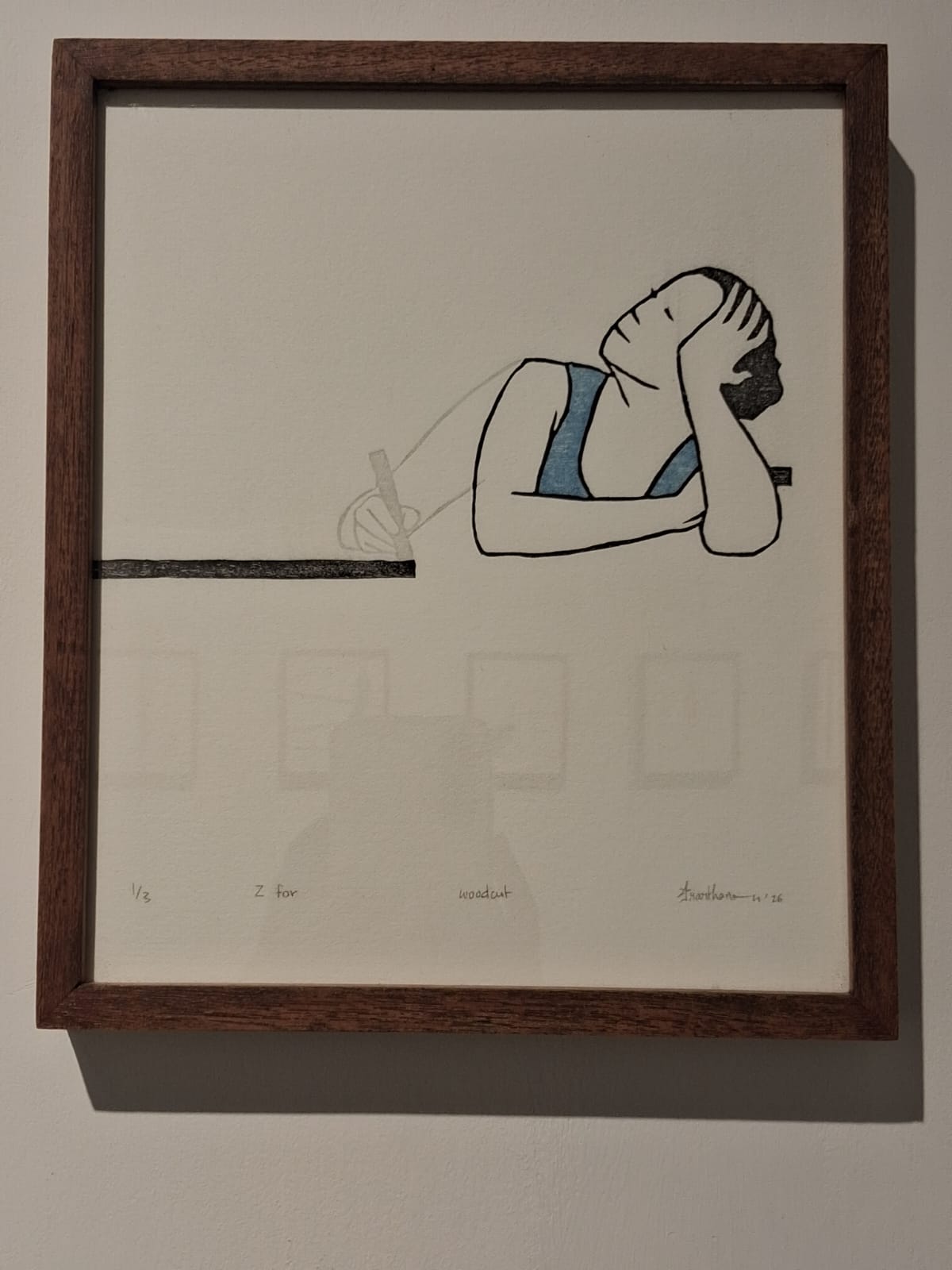
The suite of 26 works that mark Prarthana Hazra's return to printmaking create a new vocabulary of artistic introspection. Conceived as a primer, each piece stands for an alphabet that dramatizes a noun or a verb -- that we necessarily do as humans (L for listen, O for observe), or are essential qualities we need in our lives (B for balance, S for strength), or states of mind (N for neglect, P for procrastination), or experiences that are inevitable in our journeys (R for rebuild). This whole range is given form through the simple device of a line which a lone female figure (resembling the artist) repeatedly negotiates with.
The artist however doesn't name the verbs; she leaves it for the viewer/visitor to complete... pencil-writing only the alphabet and work details at the bottom. This matches the overall tentativeness of the suite.
What makes the series particularly fascinating - and underlines its tentativeness - is the embossed impressions that accompany the printed figures: denoting repetition, continual or failed attempts, and unrealized possibilities. It presents both experience and practice as a palimpsest of memory, with the body as its locus.
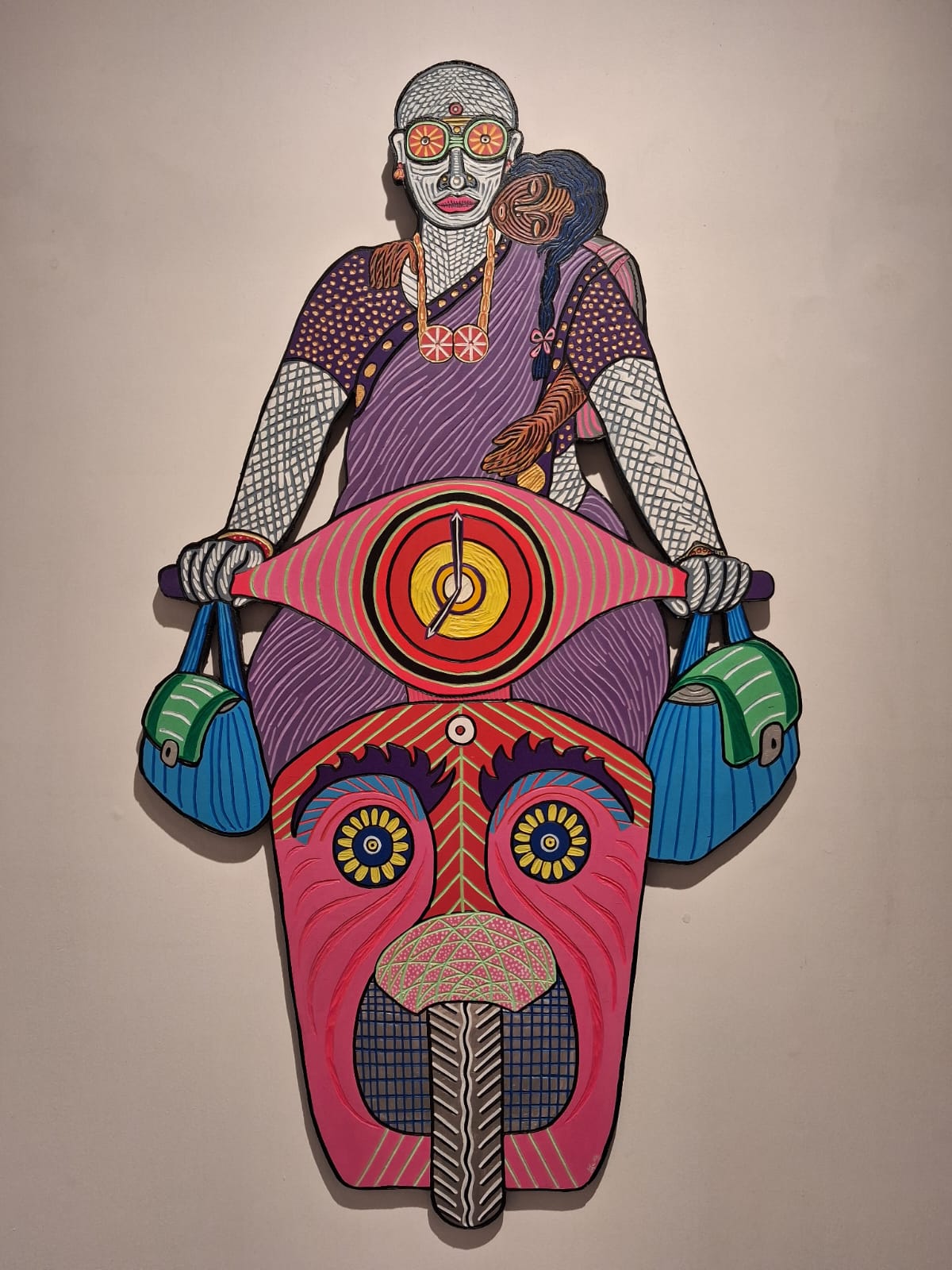
In sharp contrast to Prarthana's minimalist aesthetic - the little, waif-like figure in 26 variations depicted only in outline, in muted solids - are the massive, feisty figures (mostly women) in vibrant colours by Portia Roy, seen (primarily) from the perspective of marginalized labour.
Anyone who has lived in Chennai will have encountered the unapologetic brightness of the colours everywhere. Portia does justice to that – from the everyday sarees of women and the ornaments of dancers, to the flowers woven into garlands and the poster art on autos. Structured around a set of three series - 'Beneath the Tower', 'To Chennai with Love' and 'Home is Where I Prefer to Die' - these engraved and painted plywood cutouts are Portia's ode to both the city and the people who make it tick. I found three in different sections that could as well be a mother-and-child triptych.
Mausumi Roy's glazed stoneware ceramic sculptures are imbued with a whacky sense of humour in its reinterpretation of fables and myths. My favourite is the puny confident rat riding a flabby cat ('When the Bell Finally Rang'), followed by the meditative gentleman Ganesha, and the shocked vulnerable Royal Bengal tiger. I also found the blue cat (titled 'Companion') arresting in its beauty.
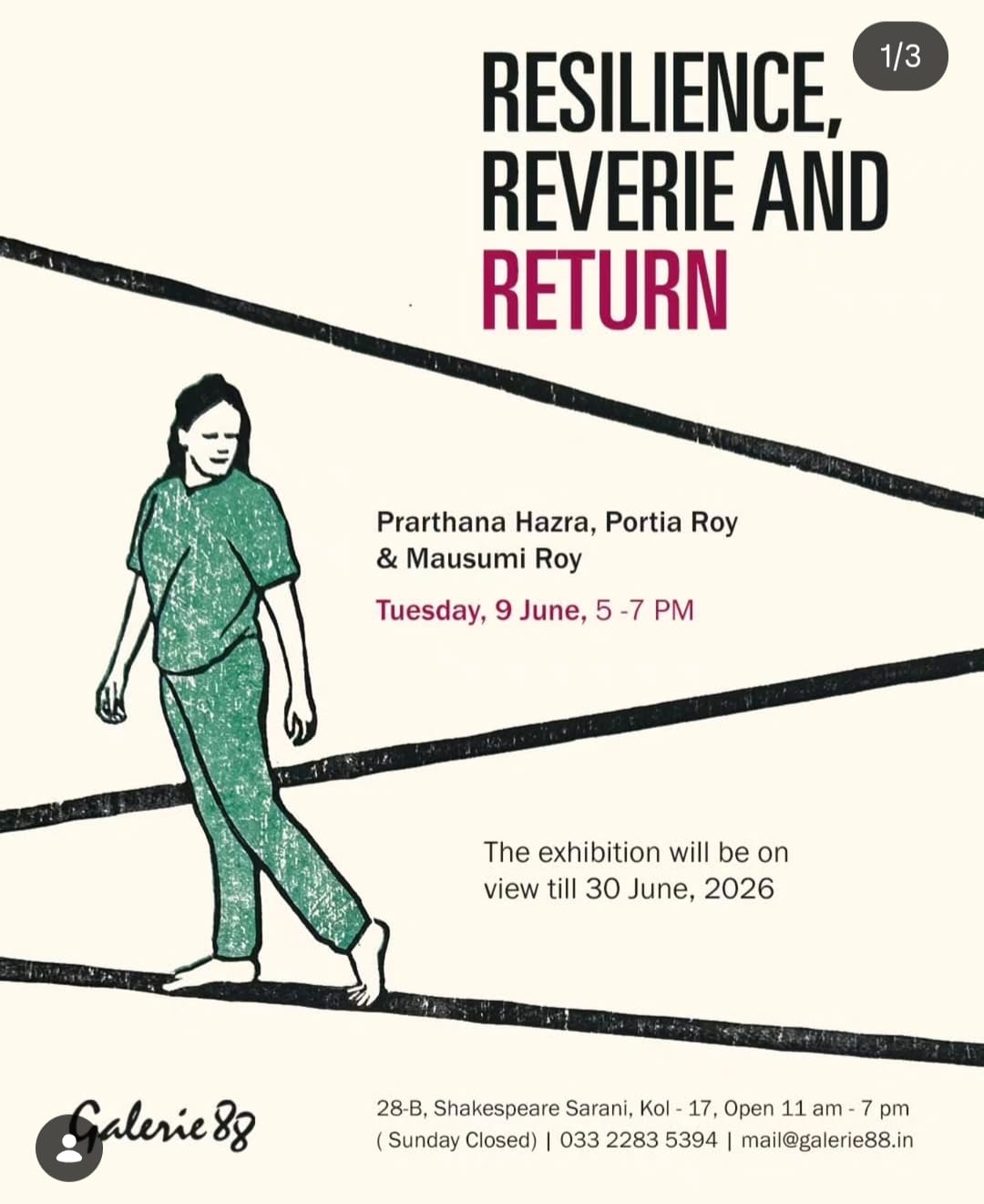
RESILIENCE, REVERIE AND RETURN, showing at Gallery 88, bring three very interesting practices together. However, one can discern a more direct conversation between Prarthana's and Portia's work, than theirs to Mausumi's.
The show has been extended till 18th July. Friends in Kolkata, do visit!